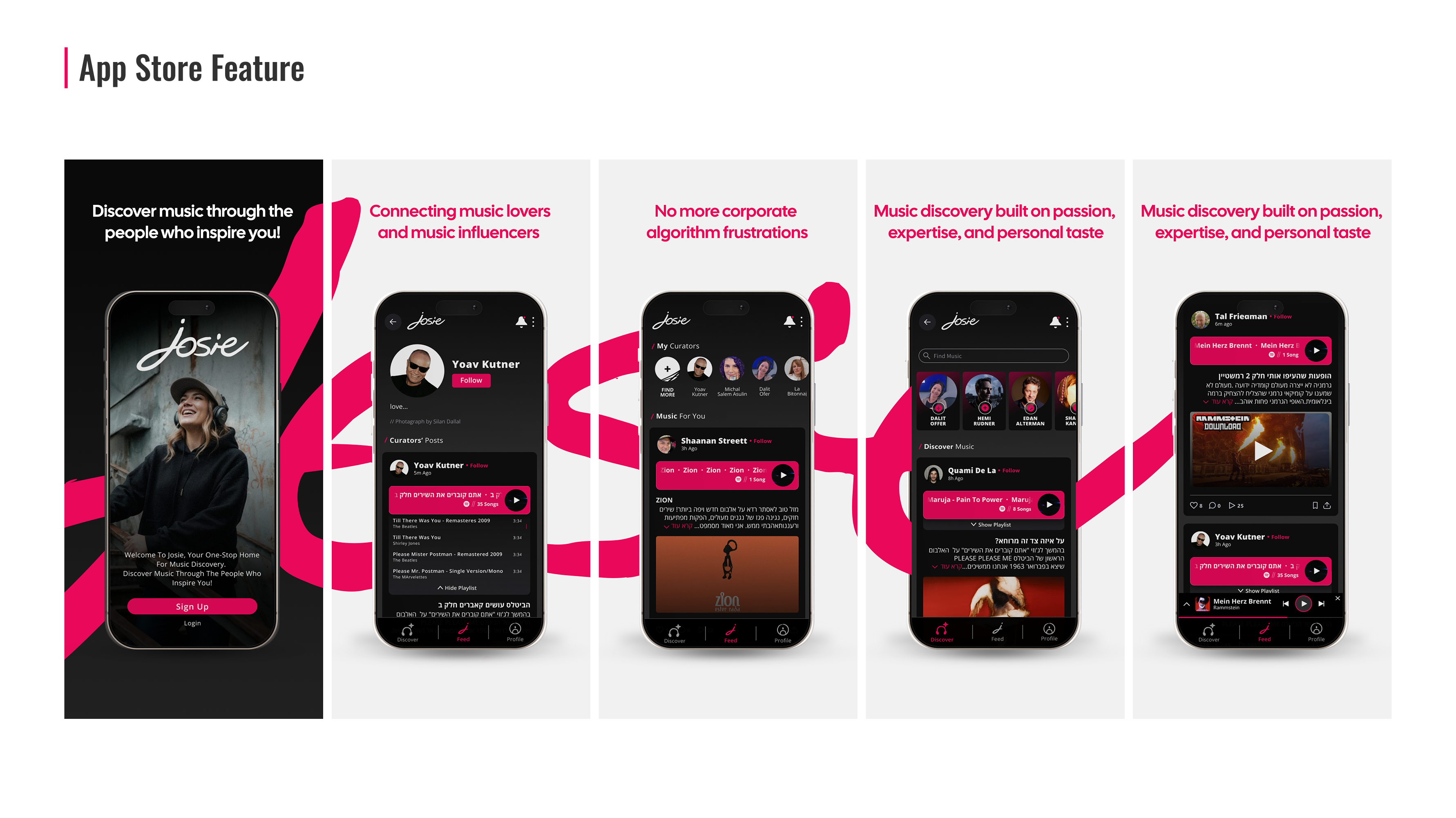
Josie is a social music platform built for people who truly love discovering and sharing music.
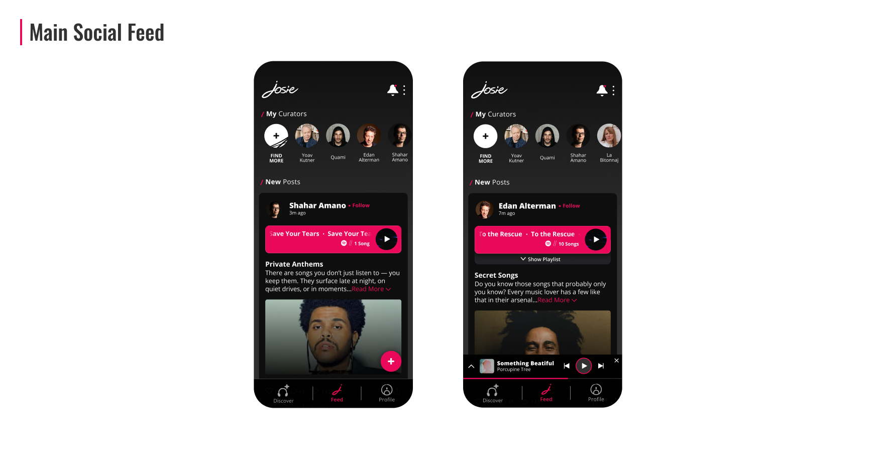
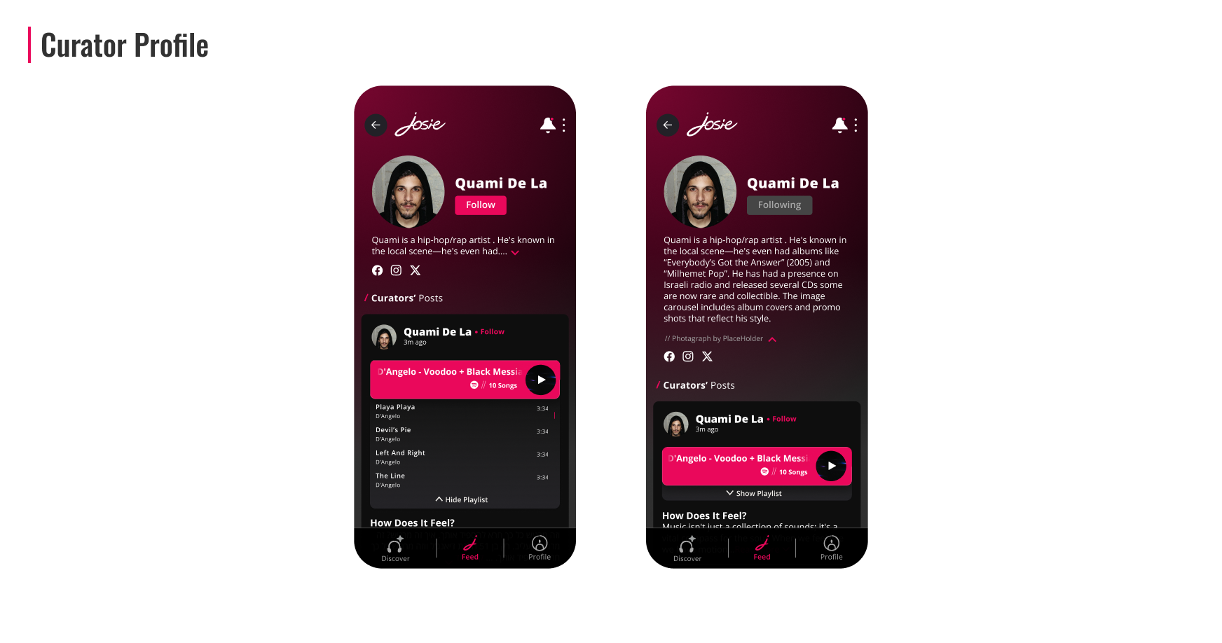
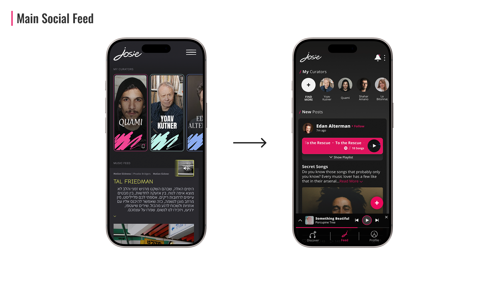
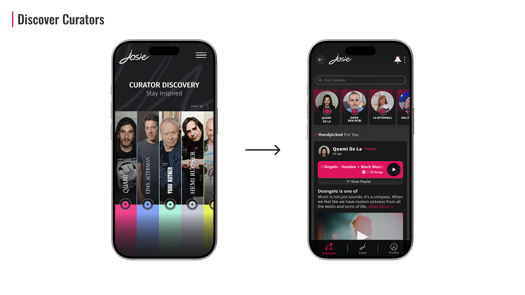
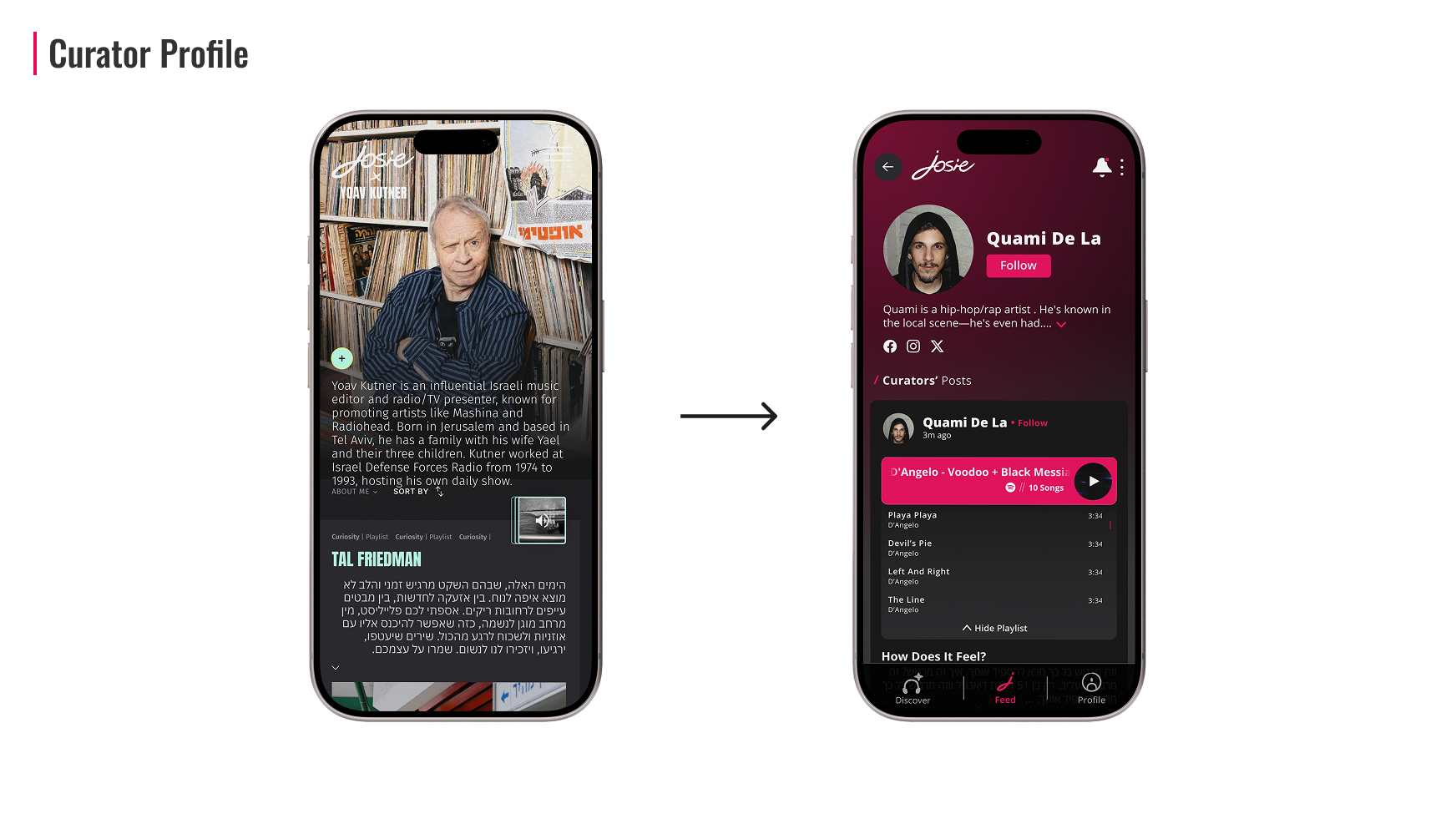
The app features both official curators and everyday users who can become curators themselves. Each curator creates posts that include a hand-picked playlist and a short written insight about any topic from personal stories to genre deep-dives, album breakdowns, or cultural moments.
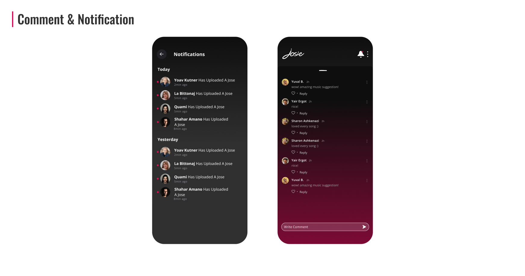
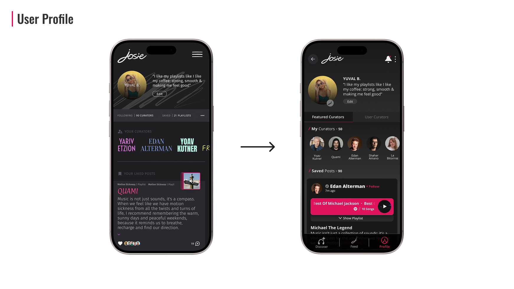
Users can follow curators, interact through likes, comments, and shares, and build a community around their musical taste.
Josie fills a major gap for audiophiles and passionate music-seekers who want more than algorithmic recommendations. It’s a space for finding rare, unexpected tracks that would never appear on your usual radar and for exploring the musical tastes of the artists, musicians, and creators you admire.
I joined Josie after the logo and a very early structural and design skeleton were created by a previous designer. From that point forward, I led the entire redesign of the product, transforming the concept into a fully realized, modern experience.
My work included:
- Rebuilding the UX: refining user flows, navigation patterns, and content hierarchy.
- Redesigning the complete UI system: colors, typography, spacing, grids, components, buttons, cards, and interactive elements.
- Creating a scalable design system for the product team and developers.
- Designing all app screens: feed, curator pages, playlist view, curation tools, settings, onboarding, and more.
- Ensuring visual consistency and brand alignment across the whole product.
- Preparing dev-ready files and collaborating closely with the development team.
There isn’t a dedicated place for music lovers to:
- Discover music through people they admire.
- Share their own taste with context and personality.
- Engage with music beyond passive listening.
Existing platforms focus heavily on algorithms, leaving a gap for human-led music discovery.

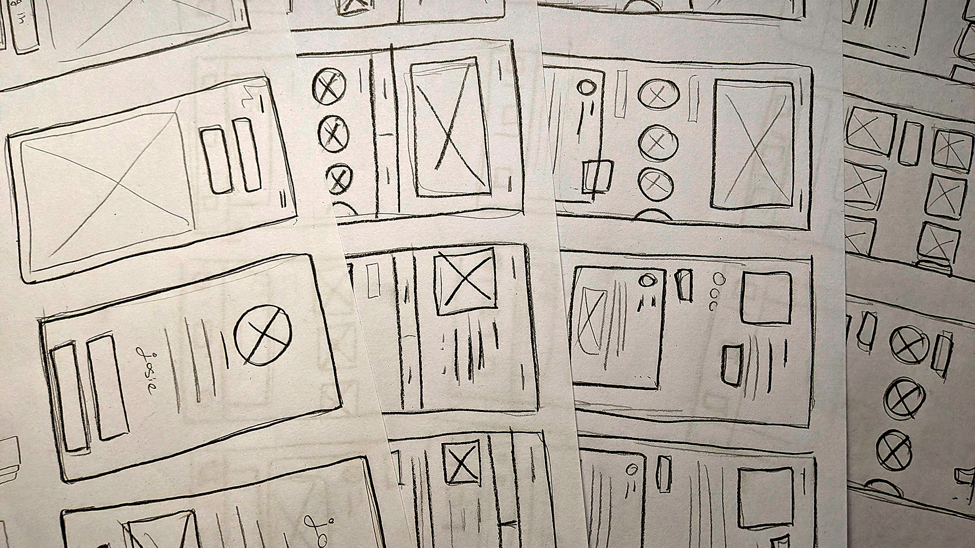
Low-Fi Frames
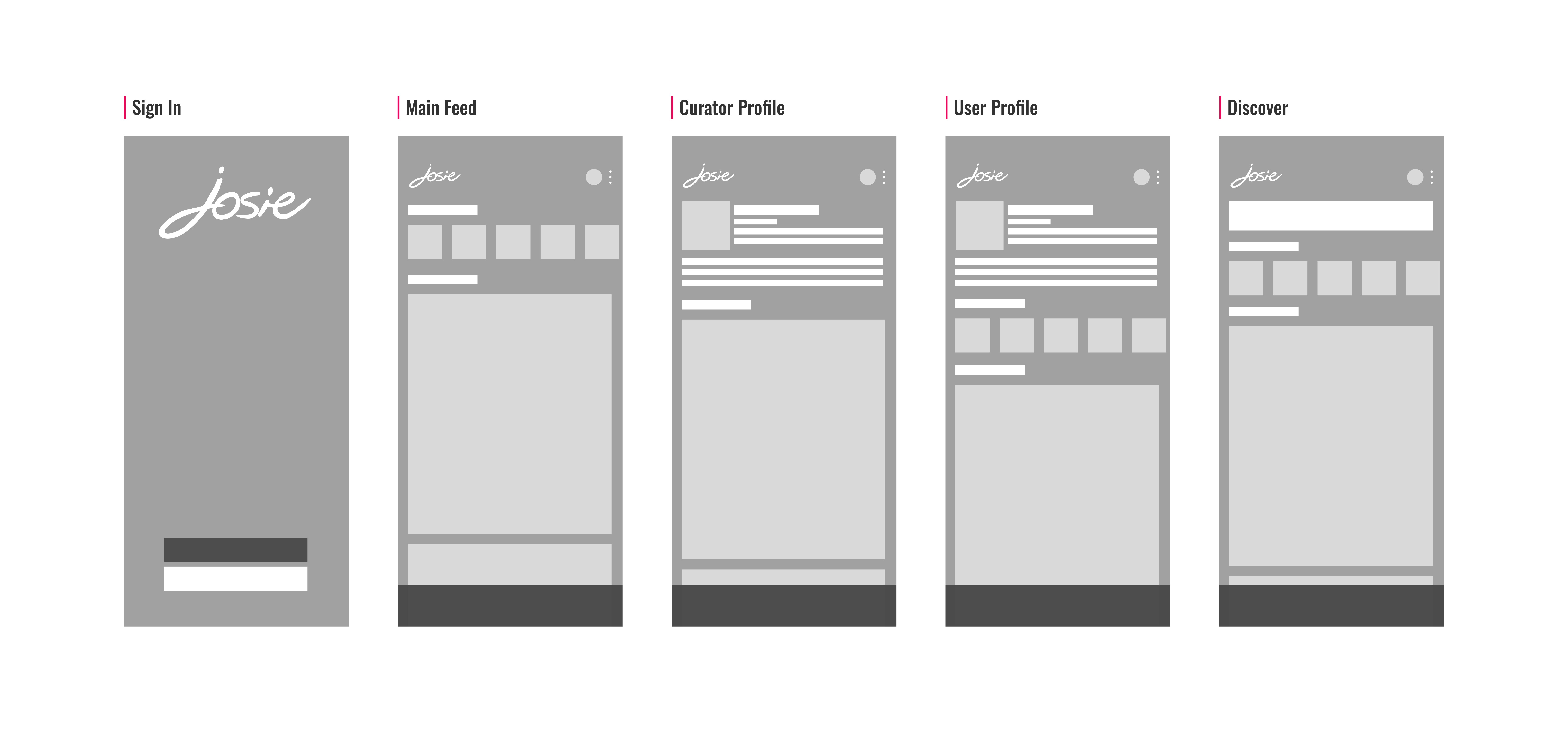
High-Fi Frames
Before & After Redesign Examples
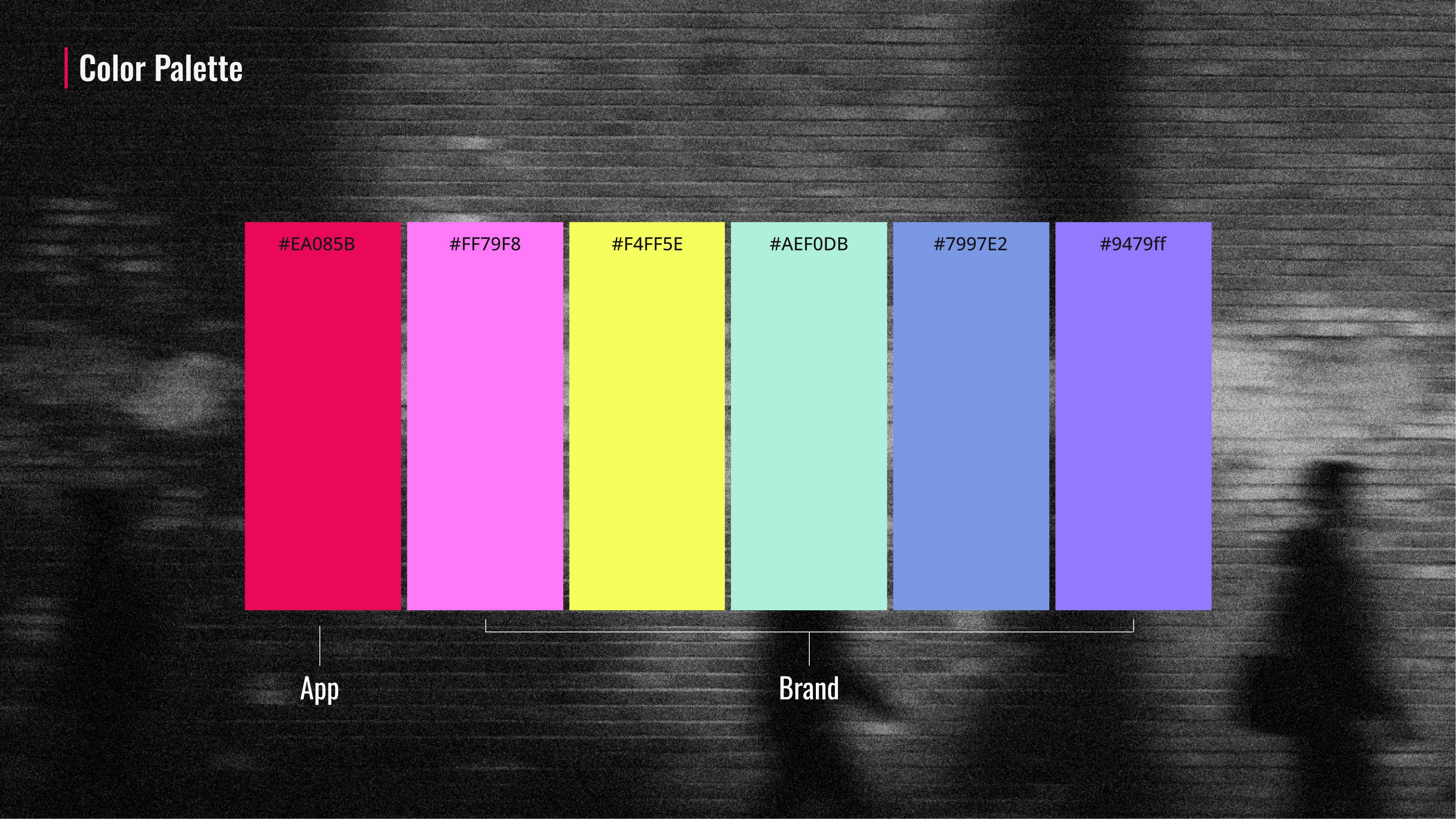
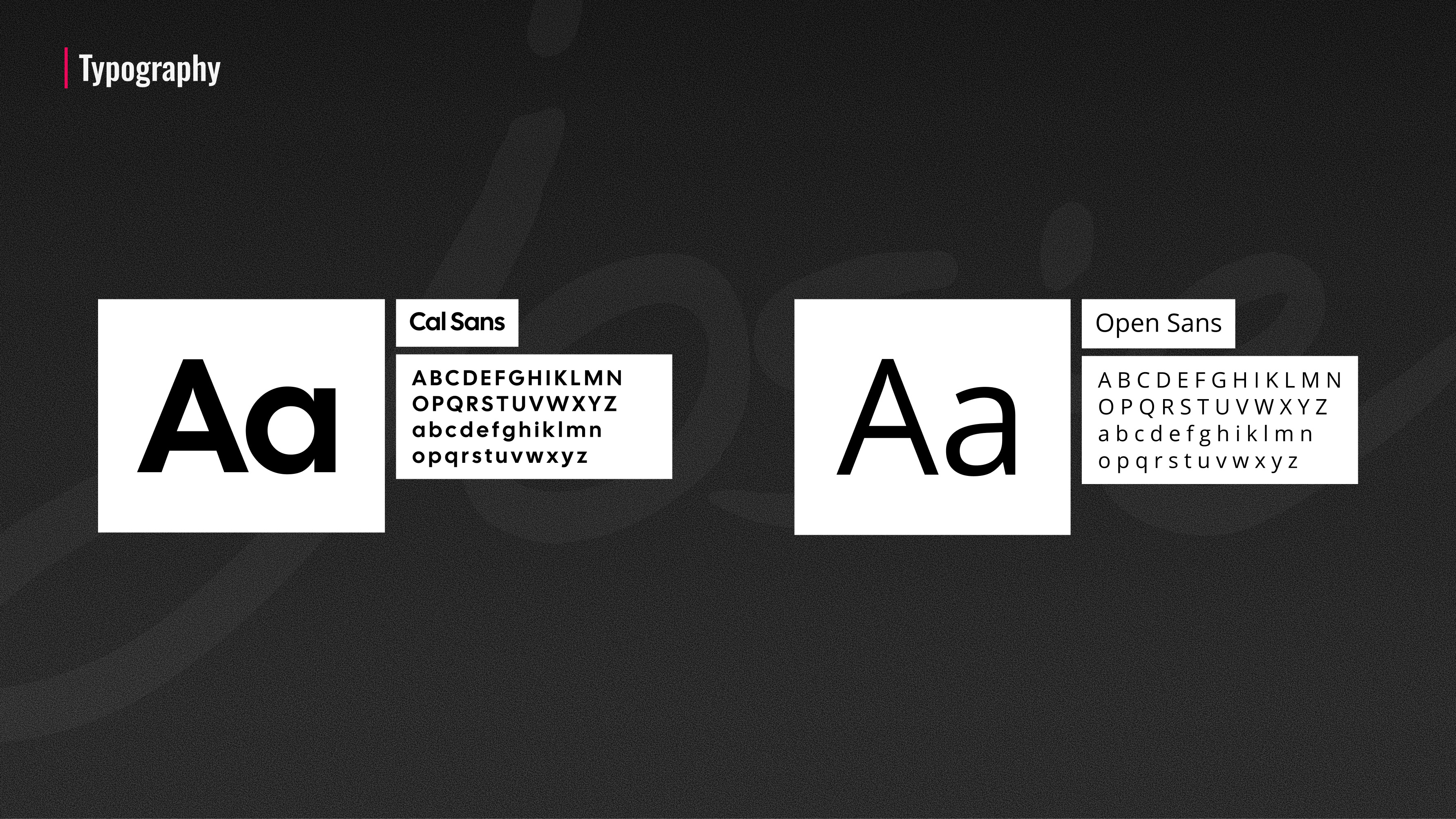
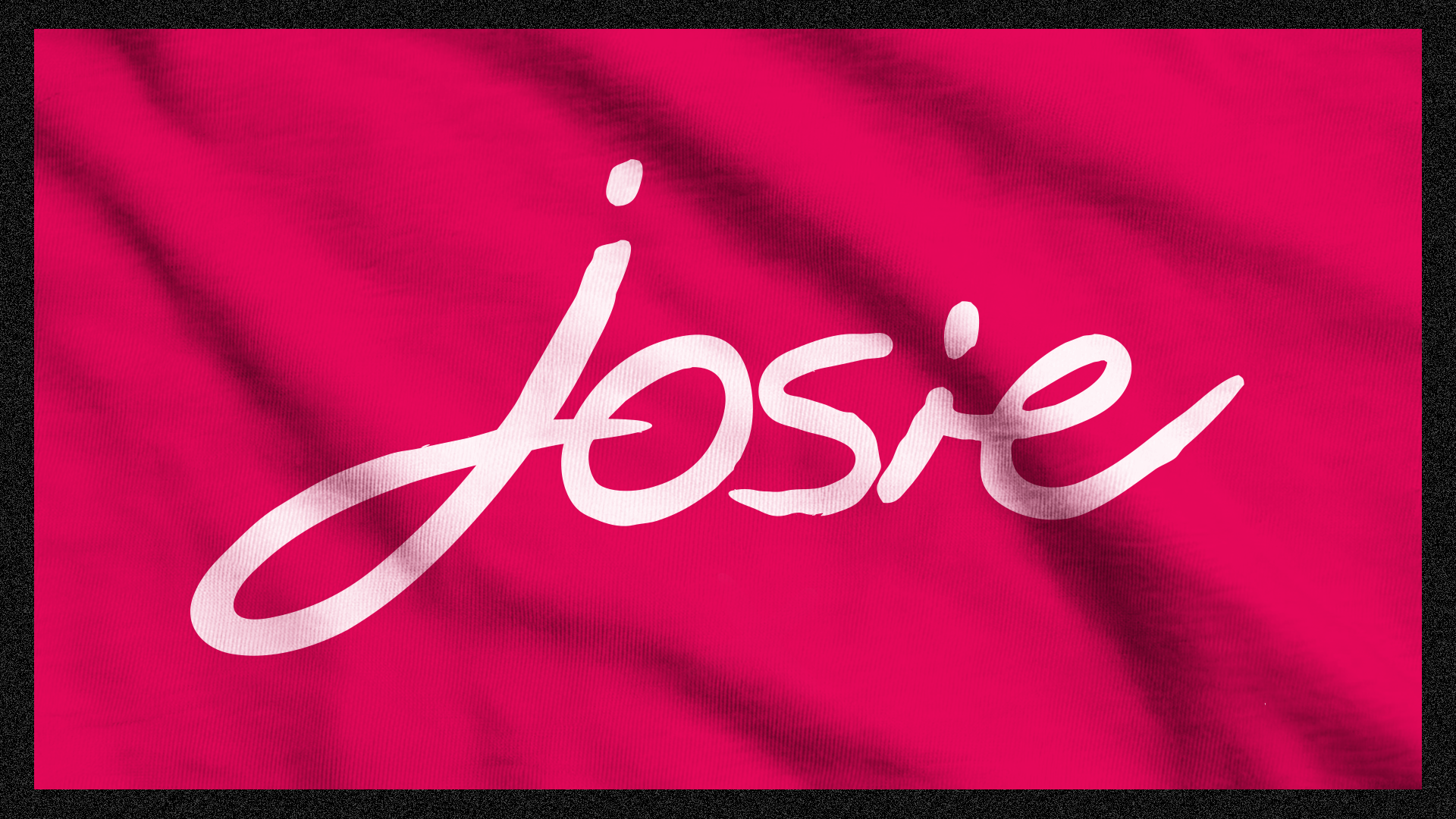
The refreshed brand needed to:
- Feel fresh, young, and confident.
- Use bold typography and high-contrast color.
- Match the expressive nature of music culture.
The visual system leans on:
- Strong type-led layouts.
- Punchy color moments.
-Minimal UI chrome to keep focus on content.
Branding decisions were designed to amplify expression and individuality, mirroring how people talk about and experience music.